
In the dynamic realm of design, where visual language speaks volumes, typography emerges as a silent yet powerful force shaping the essence of brand identity. As we navigate the digital landscape, the choice of typefaces becomes a critical element in conveying not just words but the personality and character of a brand. Welcome to a journey where every curve, serif, and sans-serif holds the potential to define the very soul of your brand.
Font Makes Us Feel
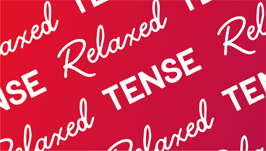
When choosing the right font for your project it is important to consider how you want the reader to feel. Different font choices can put the reader in a different frame of mind by evoking different emotions. This is particularly important in branding as the mood your font choice sets reflects against the brand. Selecting the perfect font for your project involves more than just aesthetics; it’s a nuanced decision that extends into the realm of emotional connection.
Fonts possess a unique ability to influence the reader’s emotions and frame of mind, making the careful consideration of typefaces paramount in any design endeavour. Fonts act as visual cues that can trigger specific emotional responses. Serif fonts, with their classic and traditional associations, might instill a sense of trust and reliability. On the other hand, sans-serif fonts, with their clean lines and modern appearance, often evoke feelings of simplicity and innovation. Script fonts may add a touch of elegance and sophistication, while bold, heavy fonts can convey strength and confidence.
Obscuring Text
An important part of typography is understanding how to manipulate text effectively. Obscuring text can make it unreadable and the message can become lost, however, you can obscure parts of text to your advantage. By ensuring the text is still legible you can make simple text more engaging. While obscuring text has the potential to render it unreadable, judiciously applied techniques can transform this challenge into an advantageous design element. Striking the delicate balance between visual intrigue and legibility is a key facet of effective text manipulation. By mastering the skill of manipulating text with intention, designers unlock the potential to transform ordinary text into a captivating visual experience. Whether it’s a bold statement on a website, an eye-catching headline in print, or a social media graphic that demands attention, thoughtful text obscuration becomes a dynamic tool for elevating the overall impact of typographic design.
Negative Space
In the intricate realm of typography, the subtleties extend far beyond the arrangement of individual letters. While kerning, the deliberate adjustment of spaces between letters, plays a crucial role in achieving typographic harmony, the strategic utilization of negative or null space emerges as another indispensable element in the designer’s toolkit. Understanding and harnessing the power of negative space is pivotal for creating compositions that are not only aesthetically pleasing but also highly effective in conveying the intended message.
Negative Space as the Silent Player:
Negative space, often referred to as white space, is the unmarked, empty space surrounding and between the elements of a design. While it may seem like a void at first glance, in the hands of a skilled typographer, negative space transforms into a silent player that influences the overall visual impact of the composition. It’s the breathing room that allows individual letters and words to stand out and, in turn, enhances readability and comprehension.
Enhancing Readability and Legibility:
Strategic incorporation of negative space is a design choice that goes beyond mere aesthetics; it profoundly affects the legibility and readability of text. By allowing sufficient space around characters and lines of text, designers prevent visual clutter, reducing the risk of letters blending into one another. This, in turn, facilitates a smoother reading experience, ensuring that the message is conveyed with clarity and precision.
Typeface Choice
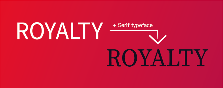
Font & Typeface are often confused as being the same thing, however, typeface and font refer to slightly different aspects of typography. A typeface is a collection of fonts of the same family with different styles, for example Arial. A font is a single style applied to text, for example Arial italic. There are several group styles of typeface that it is important to be familiar with as they all can be used for different applications and styles of work. Take the example below. The use here of a serif typeface changes the style of the text to match its content.
To find out more about the design & marketing related services I offer check out my Creative Services Page